Want to create opt-in pages that convert like crazy? Then you’re in the right place!
In this guide, we will teach you everything you need to know about opt-in pages and how to optimize them to get the results you need.
We’ll cover everything from design tips to conversion tactics, and a whole lot more. So whether you’re a beginner or an expert, this guide has something for everyone! Before we jump into the topic, let’s answer a few common questions about opt-in pages: What is an opt-in page?
What’s the difference between an opt-in page and a landing page?
What’s the difference between an opt-in page and a squeeze page?
We’ll then move on to the elements that make a perfect opt-in landing page and how you can create the same for your website.
What Is an Opt-in Page?
An opt-in page is a landing page created with the purpose of collecting emails or other contact information in return for something valuable.
This could be an ebook, a whitepaper, exclusive access to content, or a coupon or discount code.
These could be a useful addition to your content marketing strategy. When you’ve invested the time and effort to write content and attract readers, it makes sense to get their contact details to reach them personally. Consider employing the assistance of the best AI writer to elevate your content creation process effortlessly.
While you can create an opt-in page in a variety of formats, the most common is creating a dedicated landing page for generating leads.
While the design and implementation of opt-in pages is subjective, there are a few key elements that you should include to get the results you need.
- An attractive offer – The purpose of an opt-in page is to give something of value in return for the visitor’s contact information
- A compelling headline – You need to convey the value of your offer within a single headline. So take the time to craft something compelling.
- Clear and concise subheading – The headline grabs the attention, but the header explains the offer in clear and simple terms.
- A strong call to action – Finally, you need to guide visitors into performing the action you want them to take. It could be to enter an email address or their phone number or to schedule a call.
If you want your opt-in page to be successful, it’s important to test and tweak these elements until you find what works best for your audience.
Keep experimenting until you find the formula that generates the most leads.
Examples of Some Great Opt-in Pages That Convert Really Well
When it comes to creating opt-in pages, there are a few things you can do to ensure that they are effective.
One of the best ways to create an opt-in page is to look at some examples of pages that have been successful in the past.
Here are a few examples:
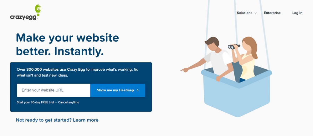
Crazy Egg’s opt-in page is simple and easy to fill out. It offers a lot of value in return for signing up, which helps to increase its conversion rate.
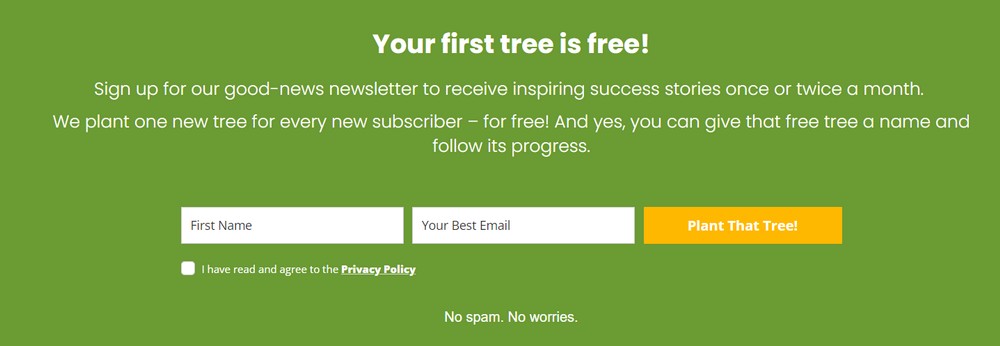
ClickATree has a great optin too. Their audience cars about the environment. So ClickATree emphasizes they’ll plant a new tree for every new subscriber!
Here’s another one from DemandCurve which is startup growth program.
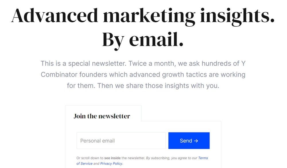
The company offers valuable marketing insights from the top startup founders that they work with and share them over email. That is a lot of valuable information for budding entrepreneurs!
These examples can give you a better idea of what makes an opt-in page successful. Keep these tips in mind when creating your own.
Opt-in Page vs. Landing Page – A Quick Summary
When it comes to creating a high converting opt-in page or landing page, there are some key differences you need to be aware of.
In this article, we’ll compare and contrast opt-in pages vs. landing pages, and explain the benefits of each type of page.
| Opt-in Page | Landing Page |
|---|---|
| An opt-in page is a simple web page that contains an opt-in form.When someone visits your opt-in page, they can enter their name and email address in order to subscribe to your mailing list or download a free product. | A landing page is a more complex web page that usually contains several elements, such as a headline, a video or image, and a lead capture form. Landing pages are designed to convert visitors into leads, and therefore usually contain more persuasive content than opt-in pages. |
| Only designed to capture leads with a single offer. | Landing pages can be used for multiple purposes including capturing leads, showcasing product features or company details. |
| Opt-in pages are the easiest to create as they have very few elements that you need to work on. | Landing pages are usually designed with a lot of information, visuals, to convey complex ideas in simpler formats. |
So Which Type of Page Should You Use?
The answer depends on your specific needs and goals. If you’re looking to collect email addresses from potential customers to use in email marketing, then an opt-in page is your best option.
However, if you’re looking to generate more sales leads, then a landing page is the better choice.
For example, if you’re launching a new startup project management platform, you would ideally use an opt-in page to gather leads for future use.
If you wanted to promote an existing project management platform, you would probably use a landing page to funnel visitors into a free trial or discounted price.
In conclusion, opt-in pages and landing pages both have their own unique benefits, so it’s important to choose the type of page that best suits your specific needs and goals.
Whichever type of page you choose, make sure to test it and use some rank tracker so you can see how well it performs.
Opt-in Page vs. Squeeze Page – A Quick Summary
Now let’s discuss the differences between opt-in pages and squeeze pages.
An opt-in page is a web page where visitors can sign up to receive email notifications or newsletters. Opt-in pages are often used to grow email lists, and they typically include a form where visitors can enter their name and email address. If you don’t feel confident enough to design your own, a web design company can create one for you.
A squeeze page is a type of landing page specifically designed to solicit opt-ins from visitors. They are often used to promote free ebooks or other types of lead magnets in order to collect contact information from potential customers.
So which type of page should you use to grow your email list?
The answer largely depends on your goals and the type of content you’re promoting.
If you’re looking to generate leads quickly, a squeeze page may be a better option. Squeeze pages are often more concise and focused than opt-in pages, which can help you capture leads more efficiently.
However, opt-in pages can be more effective at building relationships with your audience over time.
Ultimately, the best type of page to use depends on your individual marketing strategy and the type of content you’re promoting.
Try using both opt-in pages and squeeze pages to see which one works better for you. Experiment with different types of content and offers to find the ones that generate the most opt-ins.
Opt-in Page vs. Squeeze Page: Which One Is Right for You?
When it comes to lead generation, opt-in pages are a great way to build relationships with your audience over time. Squeeze pages, on the other hand, can help you capture leads more quickly.
So which one should you use?
The answer largely depends on your goals and the type of content you’re promoting. If you’re looking to generate leads quickly, a squeeze page may be a better option. However, opt-in pages can be more effective at building relationships with your audience over time.
Ultimately, the best type of page to use depends on your individual marketing strategy and the type of content you’re promoting.
Try using both opt-in pages and squeeze pages to see which one works better for you. Experiment with different types of content and offer to find the ones that generate the most opt-ins.
The Elements of a Perfect Opt-in Page
Now that we know what an opt-in page is, let’s take a look at the elements that go into one.
1. The Hero Section
The hero section is the first thing a visitor sees when they arrive at your home page. So you need to make sure it’s impactful and grabs attention.
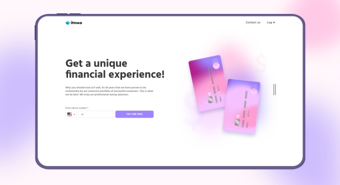
The rest of the screen is kept blank with the only visuals being the cards displayed on the right. It complements the headline and the subheadline along with the call to action (CTA).
You could easily create your own hero section with simple tools and you won’t need a top-tier computer for graphic design to do it!
2. The Headline

That brings us to the next most important part of your opt-in page – the headline. The visuals can help your page stand out, but the headline has to convey exactly what your product is all about.
Look at this example above. Within just a few words, you know exactly what the website sells. They’re selling a way to study efficiently for your SATs.
3. A Compelling Subheader
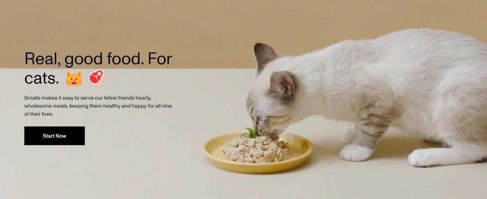
While the heading grabbed your user’s attention, you need to explain what the product actually is with a compelling subheader.
In the above example, you can see how the visuals, the emojis already complement what the product is all about. But along with that, the subheader explains the product further: “Smalls makes it easy to serve our feline friends hearty, wholesome meals, keeping them healthy and happy for all nine of their lives.”
This helps reinforce exactly what the product is all about an the customers are then ready to go ahead if they are convinced of the product.
4. Lead Magnet
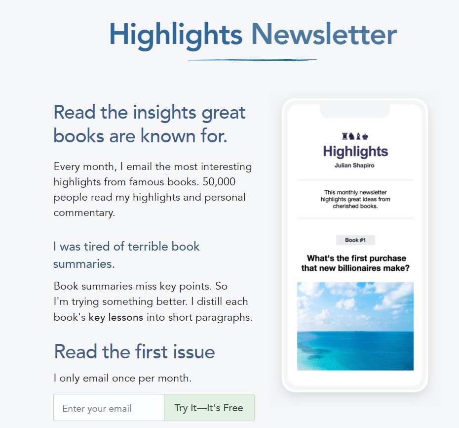
This lead magnet from Julian especially resonates with those who enjoy reading books. Julian is an avid reader and spends a lot of time every month doing so. Since his audience also enjoys reading books, this newsletter is a no-brainer. They get the key points from some of the best books in the marketing space, without spending the time to read through them all!
Here’s another example from Jamby’s. This one builds anticipation rather than giving away what the offer exactly is!
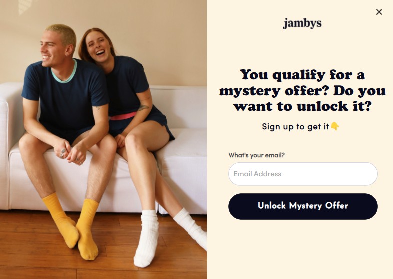
Would you drop in your email if you were interested in the products they sell? I would just to find out what this offer is!
What the lead magnet should be will completely depend on what your brand’s voice is and what your users already know you for.
But once you strike the right balance, you’ve created a lead magnet that instantly resonates with your users and they’re happy to share their contact information with you.
5. A Narrative

One of the best ways to persuade visitors to opt-in is by telling a story.
Your story should be persuasive and interesting, and it should explain how opt-ing in will benefit them.
Take a look at this example above!
This company sells jeans. But they craft this simple product into a story of how they make the jeans, and the effort that goes into making them.
This simple thing makes all the difference. People who go through this now associate the story when they purchase the jeans. And it also helps your users remember your brand better compared to other jeans brands.
6. Opt-in Form
The opt-in form is the most important element of your opt-in page. It’s essential to make it easy for visitors to opt-in by using a simple, concise form.
Here’s a super-simple form on Backlinko that just works. The home page has been converted to an opt-in page with no evident links to distract users from the purpose of subscribing to the newsletter.
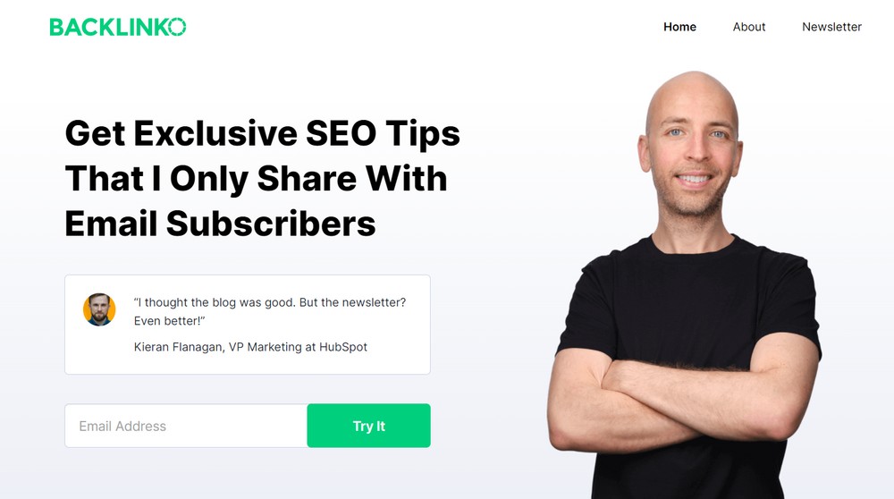
All you need from your visitors is their email and optionally, their first name. If you manage to capture both, great!
If not, there’s nothing to worry about. You still have them on your list.
7. Call to Action (CTA)
The call to action is the button that encourages visitors to opt-in. A major mistake that many businesses make is to add a generic call to action like “Contact Us” or “Get in touch”, or an even more common one “Get Started”.
These CTAs work if you have an established product that people already love and know about. But if you do not have an already existing market, these CTAs will not convey what the next step will be.
A call to action needs to tell the user exactly why they’re giving their contact information and what to expect right after that.
Here are some good examples of CTAs:
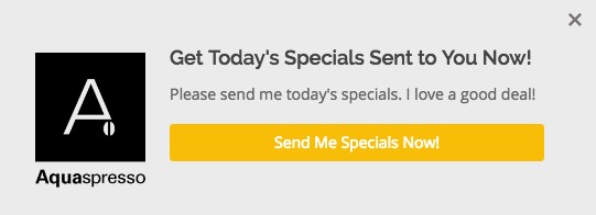
This one from Aquaspresso reinforces the “Specials” and tells the user that once they enter their email address, they’ll receive ‘Today’s Specials’ in their inbox.
Here’s another CTA button from SleepyOwl coffee that is simple and clear.

Visitors know exactly where they’ll go after clicking this button. Had it been “Get started”, it would be confusing where the button will lead to!
8. Testimonials and Social Proof (Trust)

Social proof is one of the most powerful persuasion tools at your disposal. Use testimonials from happy customers and social media badges to show visitors that others have had success with your opt-in page.
Incorporating professional support through testimonial video production can further enhance credibility and make your message more persuasive.
How to Create an Opt-in Landing Page in WordPress
In this section, let’s see how we can implement what we’ve learned on a page on our website.
CartFlows makes it simple and straightforward to create opt-in pages. Just follow the steps below to get started.
You can then customize the opt-in page using the page builder of your choice.
Let’s get started with the steps:
Step 1: Go to Dashboard > CartFlows and edit an existing flow or create a new one
Step 2: Click Add New Step
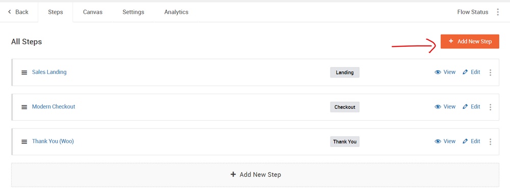
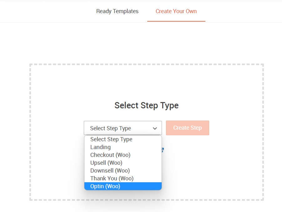
Step 3: Choose the Opt-in (Woo) section under Ready Templates and choose the template you like. The (Woo) in brackets denotes that this step works with WooCommerce. So make sure there’s WooCommerce installed on your website.

Alternatively, you can click Create Your Own and select the Step type as Opt-in (Woo)
Step 4: Now, edit the newly added Opt-in step.
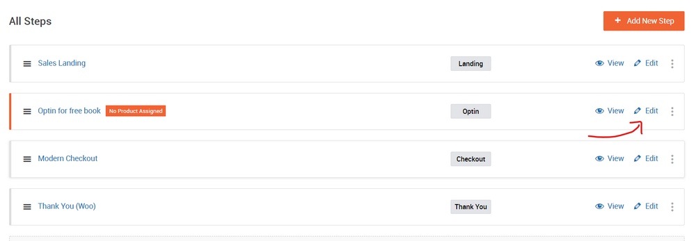
Step 5: Select a product for the opt-in offer under the Products tab.
Step 6: That’s it! You can spend your time playing around with the design of your opt-in pages as you now have it go live.
Please note, I’ve added a step to an existing checkout flow. But you can also create a flow from scratch with the intention to build an opt-in.
Opt-in Page Best Practices
When it comes to creating opt-in pages that convert, there are a few best practices you’ll want to keep in mind.
Here are some of the most important ones:
- Your opt-in page should be clear and concise. Don’t make your visitors guess what you want them to do – tell them up front and make it easy for them to do it.
- Your opt-in form should be short and simple. The fewer fields you ask your visitors to fill out, the more likely they are to actually complete the form.
- Make sure your opt-in form is above the fold. This means that your opt-in form should be the first thing your visitors see when they land on your page.
- Use compelling opt-in forms and headlines. Your opt-in form is essentially your sales pitch, so you’ll want to make sure it’s enticing enough to get people to sign up.
- Test different opt-in pages and forms to see what works best for you. Not all opt-in pages are created equal – what works for one business may not work for another. Be sure to test a variety of different opt-in pages and forms to see what yields the best results.
By following these best practices, you can create opt-in pages that are both effective and convert well.
Opt-in Page Mistakes to Avoid
When it comes to creating opt-in pages, there are a few common mistakes that people often make. Avoiding these mistakes can help you create an opt-in page that converts like crazy.
- Not having a clear goal – If your goal is not clear, then your opt-in page will not be effective. You need to know what you want your opt-in page to achieve in order to create it effectively.
- Not asking for enough information – When people visit your opt-in page, you need to ask for as much information as possible from them. The more information you can get, the better. This will help you determine whether or not someone is interested in your offer.
- Not offering enough value – People are not going to opt-in if they do not feel like they are getting something valuable in return. You need to offer them a lot of value if you want them to sign up.
- Having a complicated opt-in form – Keep your opt-in form as simple as possible. The less complicated it is, the more likely people are to fill it out.
- Not testing your opt-in page – It is important to test your opt-in page before you launch it. This will help you determine whether or not it is effective.
Avoiding these mistakes can help you create an opt-in page that is more likely to convert. By following these tips, you can create a page that will help you achieve your marketing goals.
Opt-in Page FAQs
What Are Opt-in Pages?
Opt-in pages are web pages specifically designed to collect email addresses from website visitors. They usually feature a form that asks for name and email address, along with other contact information.
Opt-in pages can be used to grow an email list, promote a product or service, or gather feedback from customers.
How Do I Create an Opt-in Page?
There are many different ways to create an opt-in page, but the most common approach is to use a landing page builder.
Landing page builders like CartFlows allow you to easily create custom opt-in pages without any coding experience.
What Should Be Included in an Opt Page?
There are a few key elements that every opt-in page should include:
- A headline that grabs attention
- A subheader that explains the offer
- A simple form to collect email addresses
- Testimonials and social proof
- Lead magnet offer in return for the visitor’s email address
- A CTA (call to action) button
Is an Opt-in Page the Same as a Landing Page?
An opt-in page and a landing page are not the same things, but they often serve the same purpose.
An opt-in page is a standalone page that exists solely to collect email addresses, while a landing page is part of a larger website or marketing campaign.
Landing pages typically have more elements than opt-in pages, such as images and videos, and they often include a sales pitch to convince visitors to convert.
Conclusion
Creating an opt-in page that converts well can be a challenge.
However, by avoiding common mistakes and using some of the best practices outlined here, you can create a page that is more likely to result in conversions.
By following these tips, you can ensure that your opt-in page is effective and helps you achieve your marketing goals.
Do you use opt-in pages? Have any tips or tricks to share? Tell us your thoughts below!

