When it comes to creating stylish layouts on a website, feature boxes are a must-have.
Feature boxes help you showcase your products and services in the best possible way by displaying them in an attractive layout. One that will make them look good and be enticing to potential customers.
Want to create stylish feature boxes with Elementor page builder?
Elementor is a popular page builder that comes with a host of features and allows you to get creative with your website design.
In this article, I’ll explain what feature boxes are and how to use the Elementor page builder to create feature box elements.
Let’s dive straight in!
What Is a Feature Box? Why Is It Required?
A feature box is an interactive section of a website that enables visitors to navigate between different sections and pages. It serves a dual purpose of guiding users and displaying enticing content about your brand and products.
By having a feature box, you capture your visitor’s attention. This works incredibly well when you have a text-heavy web page.
Use the feature boxes to present information in an easily scannable and engaging format.
Feature boxes can be used for lead generation, displaying store products and services, pricing information, and showing additional information about your brand.
You can also include a call to action within your feature boxes to direct users to your product or services page.
Examples of Feature Boxes
You will probably find a feature box on just about any website. As a business owner, if you want to promote your product or service, you surely would like to use a feature box.
Here are a few examples of feature boxes from which you could seek inspiration.
If you run an adventure-related business, you could showcase your best products in a feature box, as shown below.

Also, you could include a call to action button that takes your website visitors directly to the store page.
Do you run an online store that’s into baby products?

Create stylish feature boxes to promote your best products and your latest offers. Each of them links to its corresponding landing page.
Here are a few examples of those running digital marketing agencies.

Get prospects to connect with you by crafting a professional-looking feature box on your website homepage.
The call to action button could be directed to an opt-in form or an application, such as Calendly, to book an appointment with you.
You could also create feature boxes that include icons to promote your various services.
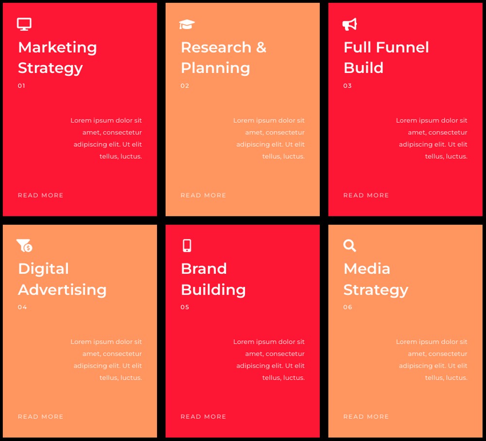
Include an outline of what you provide under each service and link it to its corresponding landing page.
Do you run a fast food joint? Want to promote your offers and best deals on your restaurant website?
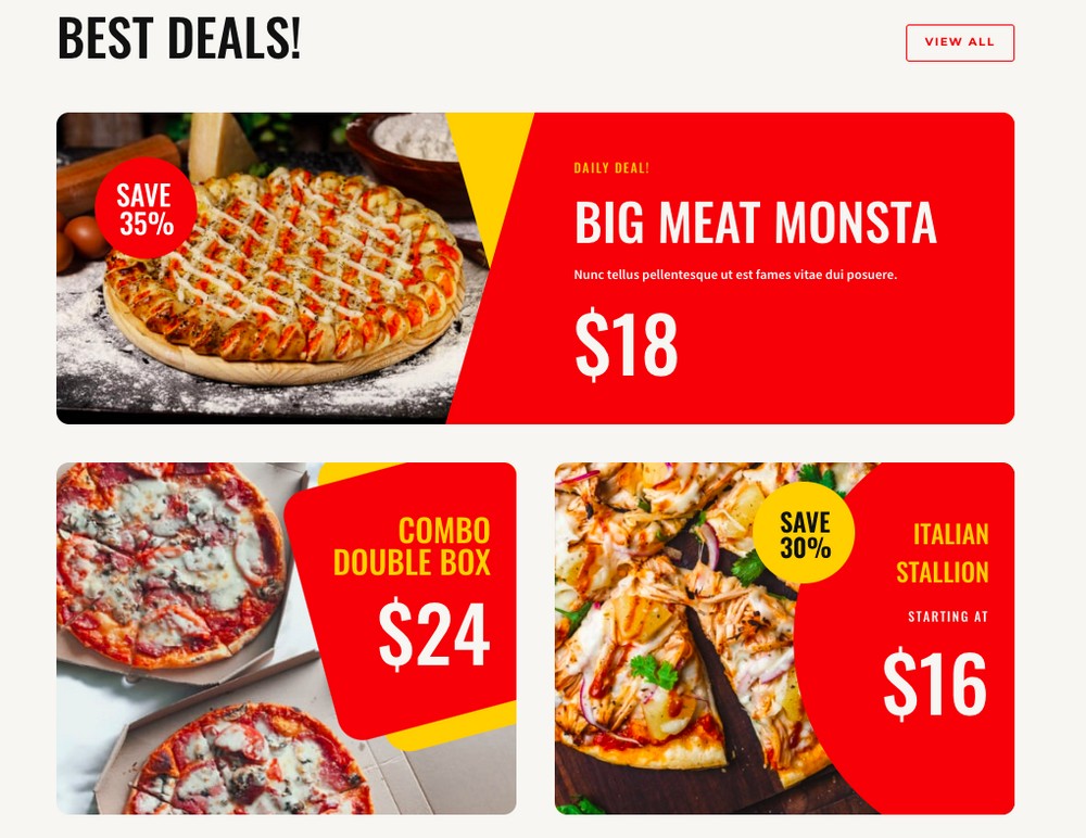
With feature boxes, you can do just that.
There are several examples of feature boxes, and we’ve barely scratched the surface. It depends entirely on your specific needs and the content you want to promote.
Want to create stylish feature boxes with Elementor? Let’s get started!
Method 1: Single Tile and Call To Action (3 Simple Steps)
First, let’s aim to create a feature box with Elementor, similar to the one below.

Step 1: Create a New Page and Edit With Elementor
Navigate to Pages > Add New and name your page.
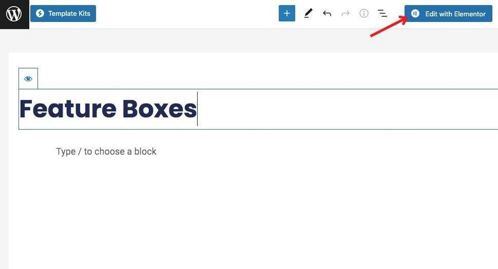
Then click on Edit with Elementor.
Step 2: Create a Two-column Layout Structure
Click on the Add New Section icon and then select a two-column layout structure.

Add some text and maybe a call to action button in one of the columns.
For instance, I’ve included a heading, text, and a button.

Next, add an image element to the other column and insert an image.

Step 3: Add a Shape Divider
Elementor makes it super easy to add various shape dividers to your sections. Not to mention, it enhances the design aspect of your feature box.
To add a shape divider, select the entire section.
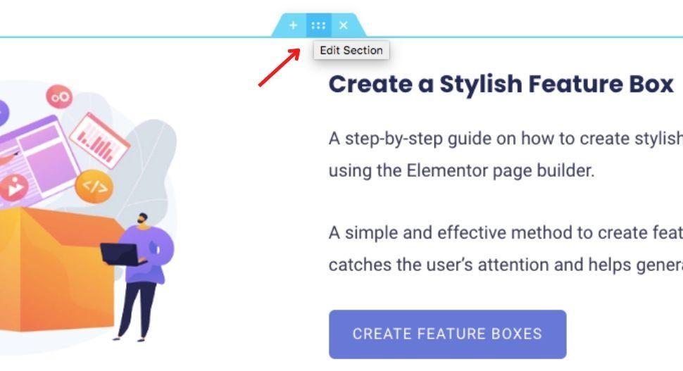
You’ll find the settings associated with the section on the left-hand side.
Select the Style tab. Then, scroll down to the Shape Divider tab.
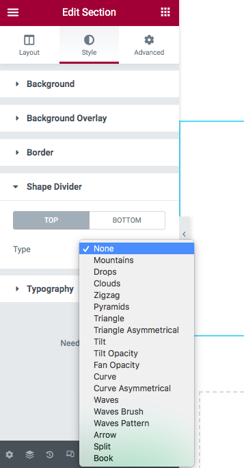
You can now select a shape divider of your choice for either the top or bottom of your section.
Play around with the options, such as color, width, and height and create a shape divider.
You can do the same for the bottom bit of your section too.
Once done, click the Publish/Update button to save your changes.

And that’s how simple it is to create stylish feature boxes with Elementor!
Method 2: Multiple Tiles and Calls To Actions
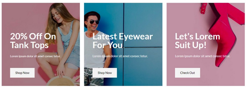
Next, let’s aim to create feature boxes, as shown below, where the text and relevant call to action buttons are placed by each image.

Step 1: Create a Three-column Layout Structure
I assume you’ve completed the first step of creating a new page and then clicking on the Edit with Elementor button.
Now, click on the Add New Section icon and select the three-column layout structure.

Step 2: Add Content and a Background Image
In one of the columns, let’s add a heading, text, and a call to action button.
Once that’s done, click on the particular column settings and select the Style tab.
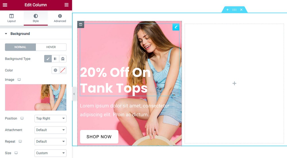
Under Background, select an image.
You can position the background image according to your requirements by selecting an option from the Position drop-down menu.
Want to add a background color? It enhances the design of your feature box and helps users read the text, especially if you are using light colors.
Head over to the Background Overlay tab.
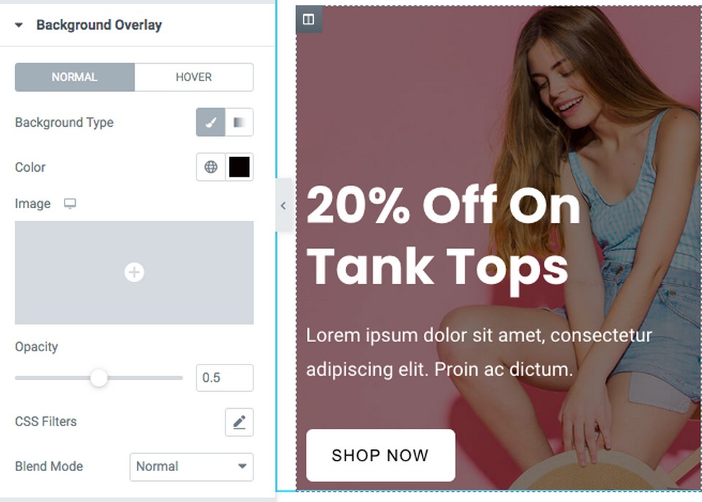
Select a color and change the opacity based on your preference.
Now tweak the text and button settings to get the perfect design for your store. You can also play around with the spacing to get your design pixel-perfect.
Step 3: Repeat the Process
If you are happy with the design of your first column, repeat the process for the other two.
You could also right-click on the column and select the Duplicate option.
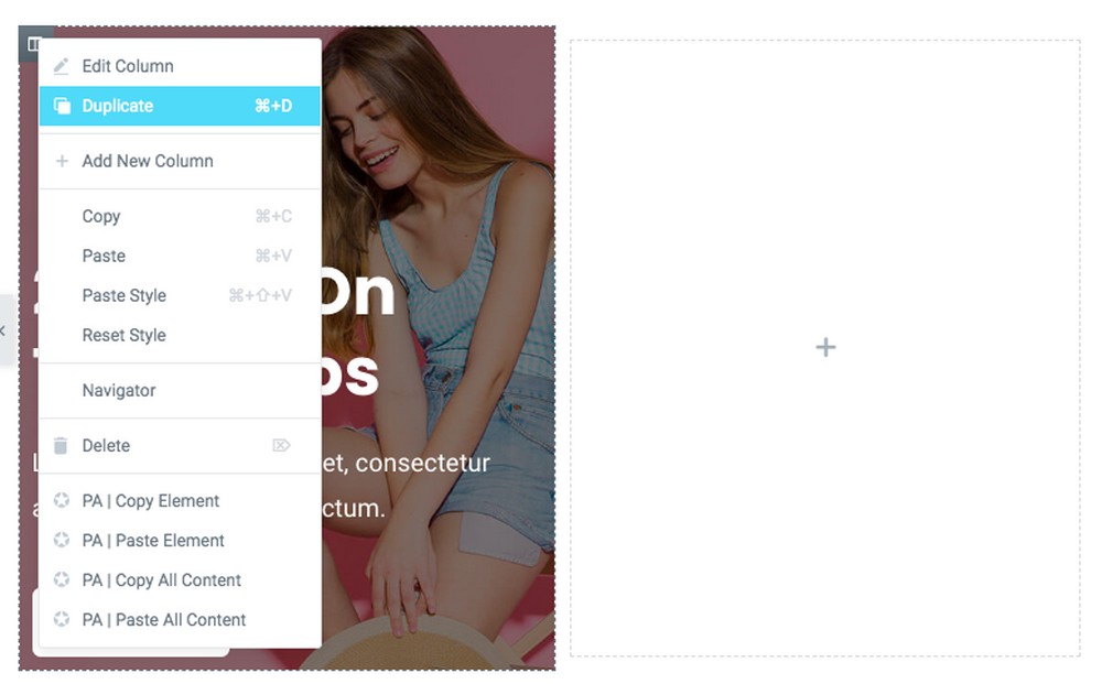
Just make sure you delete the empty columns after duplicating the first one.
Tweak the content and images for the individual feature boxes, and once you are done, you should have feature boxes similar to the one shown below.
Want more spacing between the feature boxes?
Head over to the section settings and adjust Padding under the Advanced tab.
This should give you the required spacing between the feature boxes.
Similarly, you can create all kinds of stylish feature boxes with Elementor page builder.
Have You Created a Stylish Feature Box?
Feature boxes enhance the design of any web page.
It not only helps promote some of the best content on your website, but also helps promote your products and services.
Want to add a call to action? No problem. Easily incorporate call to action buttons within your feature boxes to help visitors navigate to your featured content.
This article shows that creating a stylish feature box is pretty straightforward. And with Elementor page builder, you’ve got infinite design possibilities.
Have you created stylish feature boxes on your website? Let us know in the comments below. We’d like to hear from you!

How does this look on tablet and mobile? It doesn’t look pretty for me and I’m curious how you’d make it look great on both tablet and mobile. Thanks!
It looks how you want it really. Elementor has extensive responsive options.
I love the effect and have been trying to recreate this. However I have to agree with CDIF, I am having a hard time setting things up like you have at the beginning of the video. Maybe also because apparently things have changed a bit with Elementor since this video was released. However the only way I am able to set this up is by using two columns next to each other, adding the gradient to the very right of the left column. But then I would have to add the box shadow to the whole section and even though it is set to “boxed” and the content is in fact boxed, the shadow goes all the way up to the edge of the screen, which looks weird.
Maybe you could explain how you set up your section and columns a little bit further, that would be super helpful.
Thank you!
You need to create a section and then add an inner section. Add the box shadow to the two column inner section.
You stated that everything done in the video would be with the free version of Elementor, but the free version does not have the column feature so I couldn’t use the method you showed. I believe that is a pro feature (given the fact that you’re using pro in the video)
All versions of Elementor have columns. Free and Pro.
Hello,
Can you show start of the box creation please?
I don’t understand how to do it.
Jeff
Nice video but when you start with it already made it doesn’t really help figure it out.
Oh sorry, you didn’t find it helpful.
How have you embedded the transcript in this page so that it is scrollable within the box but doesnt scroll the whole page? I am assuming its done with elementor
Very observant :-)! Yea it’s an Elementor Post Template that I created.