
How do you make the content on your website more appealing and more engaging? Pump it up with relevant images to catch the reader’s attention. But how do you position your images to make it look better? After we have tackled the best plugins to enhance your Gutenberg experience, we’re now uncovering tips on how you can align images in your content using the new and shiny WP block editor.
If you’re already using WordPress since the release of its Gutenberg editor, you know that aligning the images using the old editor was not always the way you wanted. Although there are alignment options to choose from, the images did not always look appealing.
Now that the Gutenberg block editor is here, several issues of aligning images are fixed. You can now create attractive layouts for your pages and posts.
Let’s see how you can do this:
Adding and Aligning Images in WordPress
You can add your images using the following blocks:
- Image
- Gallery
- Media & Text
- Cover
Adding and aligning a simple image block
On your post, simply add an Image block.
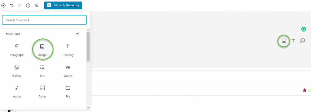
Once you’ve added the image block, you can either drag an image to the block, upload it, or select from your media library. You can also insert the image URL.

After you’ve added the image, you will see the alignment options at the toolbar on top of your image and the image settings at the right.
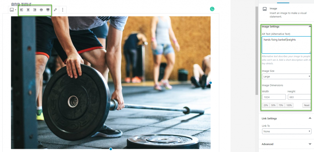
The alignment options allow you to either align your image to the left, center, right, in wide width, or in full width.
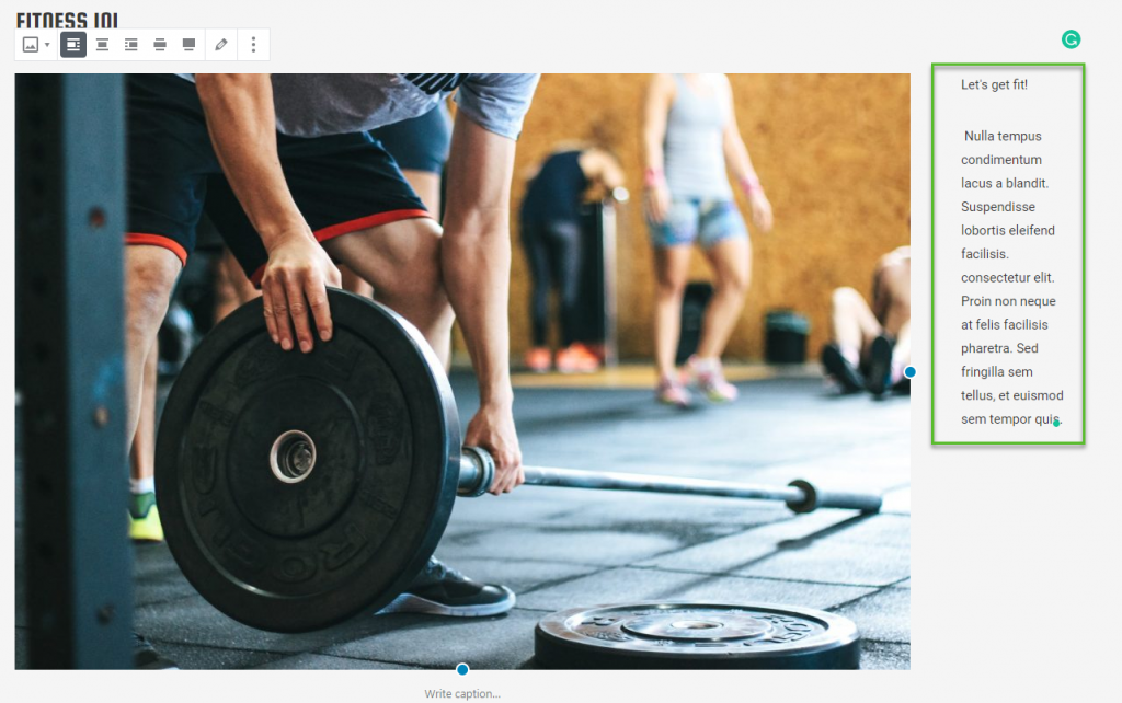
When you align your image to the left or right, the text will show up next to your image.
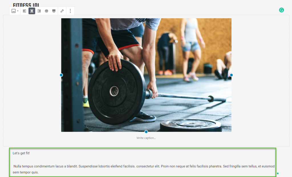
If you align it to the center, it will display at the center and the text will display below the image block.
Alternately, choosing the wide width option, your image will be wider than the text area.
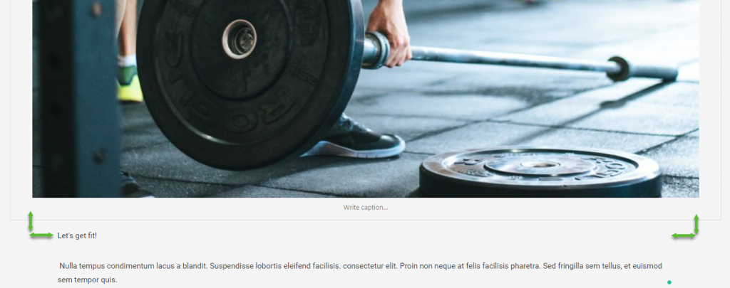
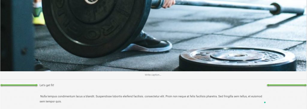
If you choose the full width option, your image will be pushed to the right and left edges of your browser screen.
Aligning an Image Next To Text
Now, in perfectly aligning your image to text, you will need to use the Media & Text block. It’s actually a two-column section for media and text content. Just upload an image and add your text.
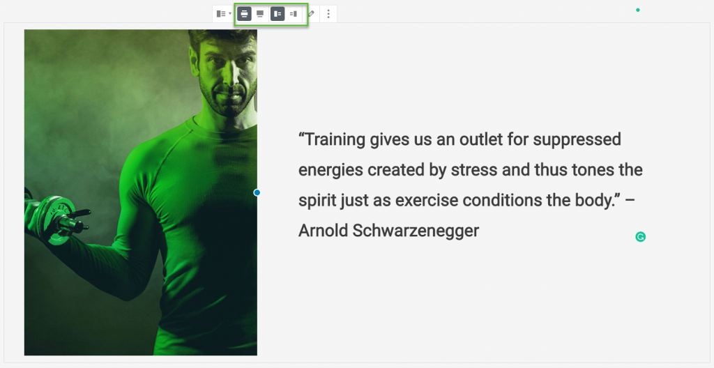
Here, you also have the option to go for wide width, full width, or switch the sides of the image and the text. You can even drag the image to resize. Cool, isn’t it?
Aligning Gallery Images
You can also add image galleries in a grid of rows and columns. Just add the Gallery block and arrange your images the way you want. You can align it to the left, right, center, in wide width, or in full width.
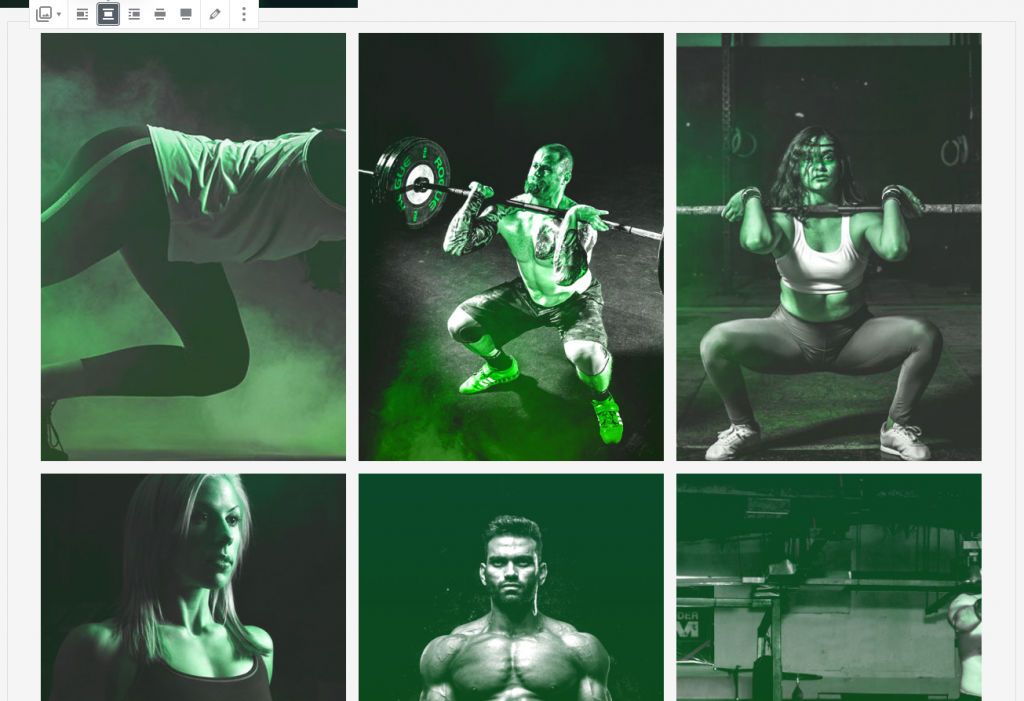
If you need more options to align your images in the gallery, you might want to add a photo gallery plugin. You can display your images in the popup and do different styling.
Adding a Cover Image
A cover image is great in creating highly engaging layouts and for featuring different sections of your page. So, if you want to add a cover image, just add the Cover block.

It has the same alignment options with the other image blocks. You can add your text over the image and then select an overlay color for additional effect.
You can also create a parallax background effect by setting your image to Fixed Background.
Adding Two Images Side by Side
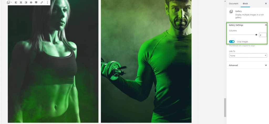
If you want to align two images side by side, you can add a Gallery block and add two images, or in the Gallery Settings, select only two columns. If you want both images to be of the same size, just tick the Crop Images toggle option.
Adding Images from Third-party Sites
You have an Instagram post that you want to add in your WordPress post or page. Well, you have nothing to worry about it because,
For example, you can simply add an Instagram block if you want to embed a photo coming from Instagram. Just add the URL of the photo that you want to share. Align your embedded post using the options in the toolbar.

There you have it. Go ahead and try adding and aligning your images in your post or page to make it more attractive and engaging to your readers.
